I led a critical redesign project that rescued a crucial partnership, improved our user experience, and created a unified design language across our booking platform. In the process, I also uncovered a significant revenue opportunity that substantially increased our flight booking revenue.
Critical
Partnership saved
18%
CES increase
1.6x
Key product attachment
The challenge
TravelPerk is a B2B tool that makes it easy for people to book and manage company travel. Flights are the most-commonly-booked type of travel.
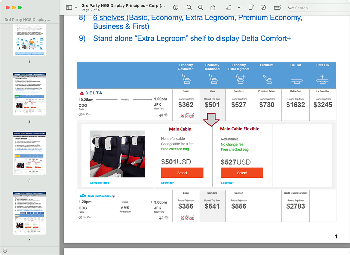
Delta Airlines was enforcing new guidelines for how vendors should display their products. The guidelines were created for leisure travel, as a way to promote and upsell more profitable flight fares.
Delta's strict 'visual design guidelines' (yep, a crude wireframe within a PDF)
The impossible position
Employers actively instruct their employees to avoid upselling attempts to maintain strict policy budgets. This created a fundamental misalignment between Delta's goals and our users' goals. Not adhering to the guidelines meant risking Delta's inventory, which would have been detrimental to TravelPerk's US market presence.
Delta Airlines' B2C-focused design requirements conflicted with TravelPerk's B2B user needs. The project also faced technical constraints, misaligned stakeholder expectations, and a rigid deadline.
As Product Design Lead and de facto project manager, I was responsible for establishing clear processes, aligning stakeholders, and balancing Delta's requirements with user needs.
Approach
With conflicting stakeholder requirements and a rigid deadline, I established clear processes and communication frameworks to align all parties and maintain project momentum.
Definition of done and success criteria.
Building confidence through research
Every major decision was backed by customer data and behavioral evidence to build confidence with both internal teams and Delta stakeholders.
Defining success
A comprehensive definition-of-done document was agreed on by stakeholders on both sides and became our key reference to prevent scope creep.
Creating feedback loops
Weekly critiques with other designers, weekly reviews with engineering, and regular usability testing kept the work aligned and grounded.
Identifying heuristic gaps
The redesign provided an opportunity to address legacy usability issues. Through a heuristic evaluation with designers from all booking verticals, we identified several improvement opportunities.
Identifying heuristic gaps. Plays when in view.
Continuous testing
We usability tested all critical flows, implemented a phased rollout, and tracked metrics. Observing real user behaviour post-release revealed actionable insights; we implemented a CES-wide approach to ongoing usability.
Continuous testing.
The solution
Armed with research insights and stakeholder alignment, we delivered a solution that satisfied Delta's requirements while improving our user experience and unlocking new revenue.
After
Before
Flight search and results: before and after.
Strategic wins
Despite Delta's rigid guidelines, I managed to negotiate key adjustments: keeping the outbound and return flight overview, and reducing fare categories from 6 to 4. These adaptations helped maintain consistency with TravelPerk users' mental models.
A localised experience
After discovering that the new design resulted in many empty results for European searches, we created separate region-specific designs: North American results follow Delta's guidelines, while other markets see a simpler design to accommodate fewer product variations.
Our heuristic evaluation revealed many overlooked areas for improvement. Redesigning the entire flow gave us the ability to apply a more-considered approach to every visual element.
Focusing on the details: heuristic-driven improvements.
Reducing interaction cost
In the old design, search parameters were hidden behind a click-to-reveal interaction despite how frequently users would adjust terms when exploring flight options. In the new design, search parameters are front-and-centre. They move out of view when scrolling down but re-appear on scroll up, making them easy to adjust at any time. We also added date nudge buttons to explore flights on different days.
Reducing interaction cost.
Updating the filtering experience
Moving from a side panel to a horizontal progressive disclosure pattern accommodated Delta's requirement for more horizontal space, while fixing IA and visual hierarchy issues that plagued the previous design.
Updating the filtering experience.
Fixing consistency across verticals
We prioritised standardising the booking experience across all verticals as a core redesign goal. Each pattern was designed for cross-vertical compatibility and evaluated by all teams throughout the process.
Fixing consistency across verticals.
Turning constraint into revenue expansion
While solving Delta's requirements, we identified a significant revenue opportunity. In the previous design, all users would see the FlexiFare option as part of the booking flow. In the new single-screen layout, only users selecting Basic fares would see FlexiFare—risking reduced visibility and revenue. I proposed expanding FlexiFare to Basic and Standard categories, which would boost visibility and increase revenue potential due to percentage-based pricing.
Turning constraint into revenue expansion.
Outcome
The project succeeded on multiple fronts, delivering both business and user experience improvements. We secured the Delta partnership while improving key metrics, fixed legacy UX issues, established a unified design system, and increased revenue through expanded cancellation coverage availability.
The new Standard FlexiFare variant increased attachment (1.6x key product attachment), representing a huge revenue increase. We achieved an 18% CES increase. Most importantly, we reaffirmed our partnership with Delta while improving the user experience across all TravelPerk's booking verticals.
Partnership preserved; metrics improved.
Learnings
Establish shared goals early
The definition of done document became our most-valuable tool for alignment and decision-making. By securing upfront agreement on scope and success criteria, we could resolve conflicts efficiently and maintain momentum.
Observation beyond release
Post-launch user behaviour observation revealed improvement opportunities invisible in pre-release testing. Real-world interactions provided insights that testing and quantitative data alone couldn't capture.
Find opportunity in constraints
What began as a challenging and disruptive project ultimately became a platform for fixing cross-vertical design issues and opening new revenue streams. The constraints forced creative thinking, proving that unexpected challenges can often lead to innovative change.