Challenge
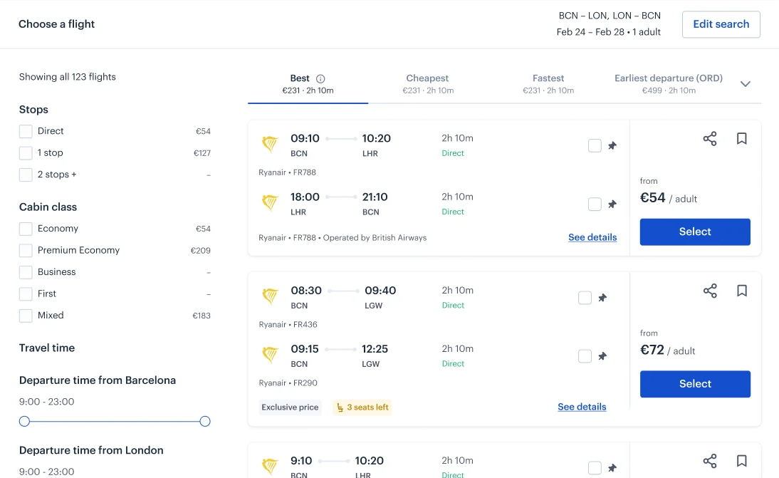
Perk (ex-TravelPerk) is a B2B platform for booking company travel. Delta was enforcing new guidelines for how vendors display their flights. The guidelines conflicted with Perk's booking model and their business travelers' mental models.
 Perk
Perk
I led a redesign that started as a compliance requirement and became something much more — rescuing a key partnership, resolving years of cross-vertical UX debt, and uncovering a revenue opportunity that drove a 1.6x increase in product attachment.
1.6x
Product attachment
18%
Easier to book (CES)
8 weeks
Design to launch
Perk (ex-TravelPerk) is a B2B platform for booking company travel. Delta was enforcing new guidelines for how vendors display their flights. The guidelines conflicted with Perk's booking model and their business travelers' mental models.
Delta and Perk had different incentives. To avoid relitigating design decisions, I created a definition of done that both parties signed before any design work began.
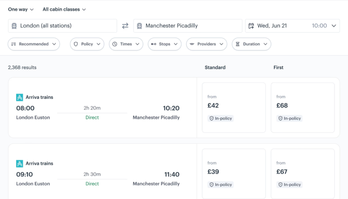
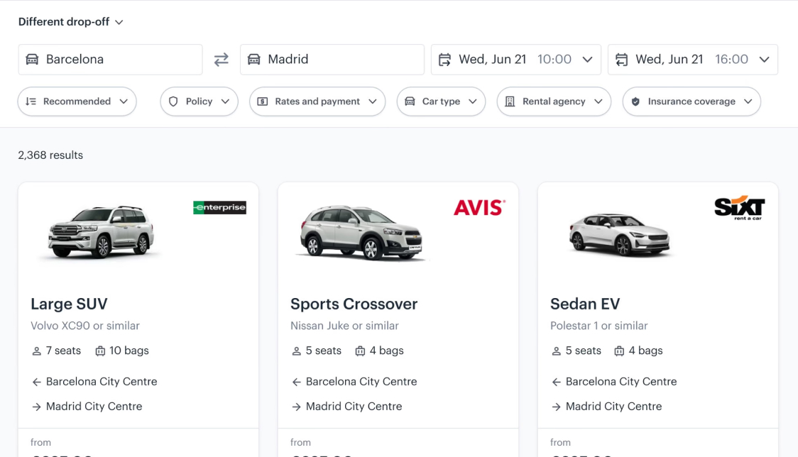
To align the design across verticals, I ran a heuristic review across flights, trains and cars with each vertical's designer.
We usability-tested all critical flows before rollout. A phased release with live session observation let us iterate continuously.
We ran a CES survey at the end of the booking flow before the redesign, so we could quantify any change in user effort.
Agreeing the definition of done up-front saved us from any potential scope changes.
Contested decisions went to customer data rather than to whoever argued hardest.
Weekly critique with engineering and incremental release rather than one big launch.
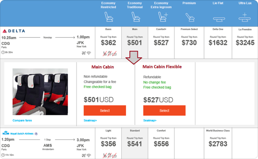
The guidelines introduced six fare tiers. Perk users can only book within their price policy, meaning the higher-end tiers weren't relevant for the majority of users.
One Delta flight from CDG to JFK. 6 fare categories sit beside the itinerary. Bookable categories show from-prices; out-of-policy categories are labelled Out of policy. Selecting a premium category expands nested fare options, each marked out of policy with a red shield cross and an Out of policy button.
I negotiated reducing the tiers from six to four: combining higher-end fares into the fourth tier. This reduced the prominence of non-viable options.
One Delta flight from CDG to JFK. 4 fare categories sit beside the itinerary, all marked in policy. Selecting a category expands nested fare options that travellers can book.
Delta's guidelines hid return flights until after choosing an outbound flight. This meant users could unknowingly choose an outbound flight with no viable return options.
An outbound flight from JFK to LAX with four fare categories. The second category is open, showing nested fares. Selecting a fare transitions to return flight cards from LAX to JFK, each labelled Out of policy, the last of which is clipped by the frame. In-policy outbound does not mean in-policy return.
I negotiated for us to keep the round-trip flight view, rather than hiding return options. This let travellers keep the ability to see viable round-trip options at a glance.
One round-trip card in the four-column fare grid. Outbound and return legs sit together beside skeleton fare placeholders, so travellers can see the full journey and whether it is in policy.
European carriers have fewer fares than American carriers, meaning almost every fare tier would be empty across most airlines.
A European round-trip card in the four-column fare grid. The first category has a fare; the remaining three columns are largely empty in the European market.
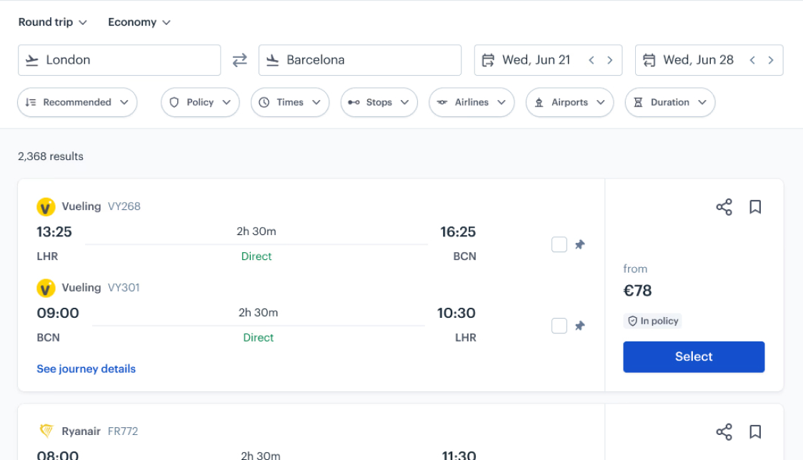
To avoid this, I designed a separate European search results view, based on the same design, but with a simplified card that didn't include the fare tiers.
One European round-trip result in a simplified single-fare column layout — one bookable fare instead of a four-column grid.
As well as implementing the new expandable fare tiers, I redesigned the flight search result card with stronger content grouping and hierarchy.
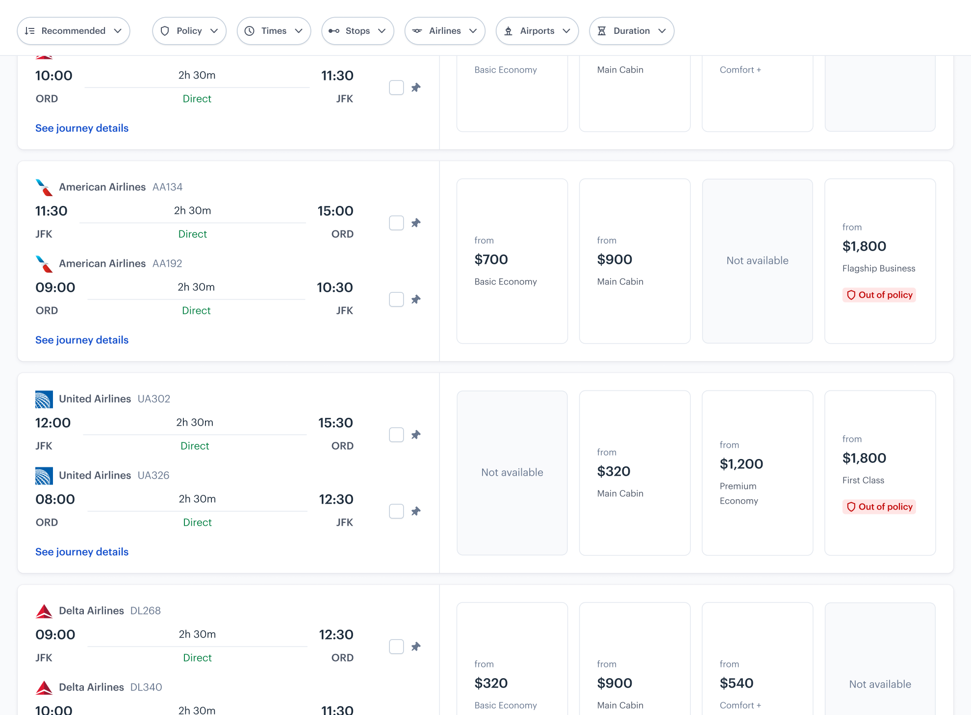
The new layout needed horizontal space that the old filters side panel was occupying. This meant we had to rethink where they lived.
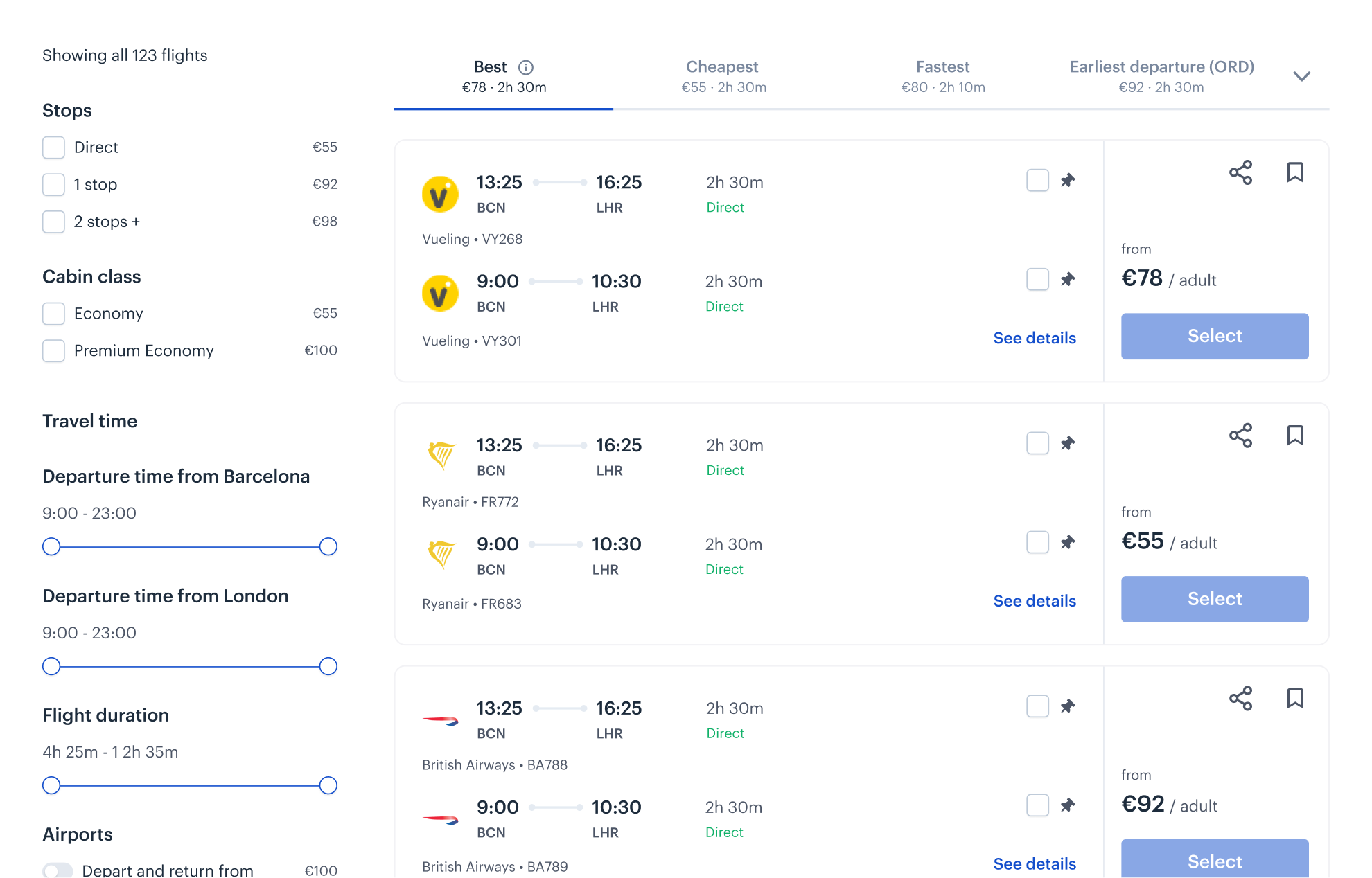
I ran a card sort to re-group filters around our users' mental models, then designed a horizontal filter experience, using progressive disclosure to reduce cognitive load .
Changing search terms was tucked behind an edit button. In live sessions, I noticed that users often missed the button and returned to the home page to adjust their search.
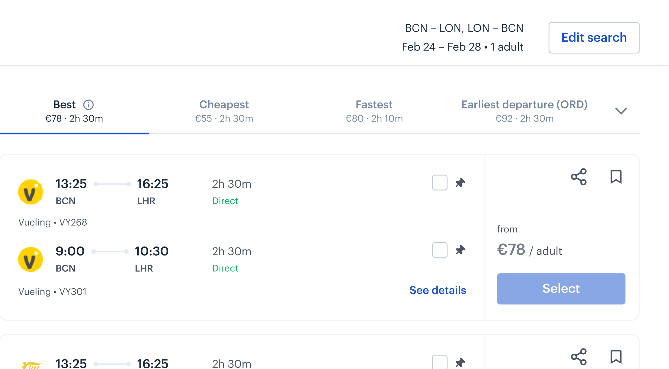
To address this, I made the search parameters editable by default, tucking away when the user scrolls down, and re-appearing when they scroll up from anywhere on the page.
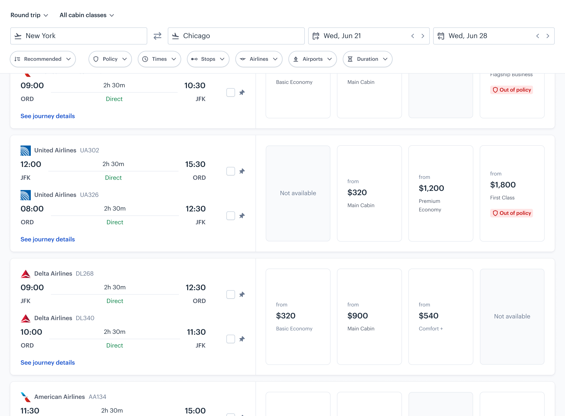
The new search experience, filters, and results cards were designed to scale across verticals, creating a unified design language.
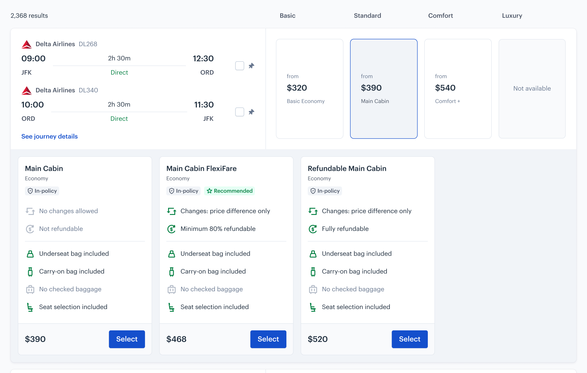
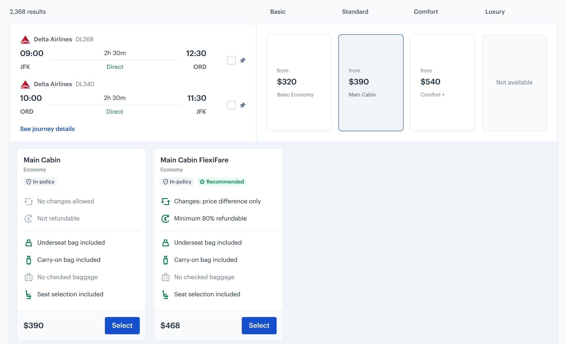
FlexiFare is Perk's flexible fare: a normal fare with a small markup for free changes and cancellation. Under the old design, it was only offered on the most basic fare.
Two fare cards sit side by side. Basic fare at $390 allows no changes and is not refundable. FlexiFare at $449 has changes at price difference and a minimum 80% refund. Both include underseat and carry-on bags, but no checked bag or seat selection.
In the old flow, every traveller saw FlexiFare as the second option on a single fare screen. In the new design, only users who chose Basic would see it.
One round-trip result with outbound and return legs stacked beside the fare categories. 4 fare categories sit beside the itinerary, all marked in policy. Selecting a category expands nested fare options that travellers can book.
I proposed extending FlexiFare across the fare tiers. This fixed the visibility problem and unlocked a major revenue opportunity that had been overlooked.
The redesign secured the Delta partnership, cleared years of UX debt, and grew FlexiFare revenue — all from a project that began as forced compliance.
The FlexiFare expansion drove a1.6x increase in attachment, representing a yearly revenue increase of several million dollars.
On top of this, overallflight booking CES improved 18%, from 3.9 to 4.6 out of 5.
The definition of done document became our most-valuable tool for alignment and decision-making. Having Delta sign off on success criteria early meant that when they pushed back later, we had something to point to.
Usability testing gave us confidence, but watching real users in Fullstory post-launch revealed behaviours we hadn't anticipated. Some of our assumptions about navigation were simply wrong, and we only caught them because observation was built into the plan from the start.
The FlexiFare expansion wasn't in scope. I spotted the revenue risk while solving an unrelated problem. This is a reminder that design exploration can lead to opportunities that aren't covered in PRDs. It's also a reminder that, if we look at them in the right way, constraints can sometimes open doors.